Showing posts with label GAFE. Show all posts

Thursday, 10 January 2019

Assignment Submission Forms

Did you miss the Ditch Textbook Summit last month? Matt Miller has reopened access to all 35 videos from January 10 to 18. There's some great stuff there, including downloadable notes and certificates of completion. Click here to sign up. If you miss it, you'll have to wait until next December.

I gave a (slightly overlong) webinar to a group of TDSB teachers about Google Drive in December, and one of the things I mentioned is that the "Shared With Me" folder is.... well, it can be a bit of a mess. Mine is, at any rate, and last year I was finding it more and more challenging to find and then systematically open any documents students shared with me, especially since I told them to deselect the "Notify me" option when sharing. I told the webinar group I would blog about how I use Forms and a Sheet to make my life easier.

Very simply: when students write up an assignment (using Docs, Sheets, Slides, etc.), they share the link with me (making sure I have edit access so I can view their revision history and make comments). I've put the link to the form on the course webpage, and also in the body of the assignments.


I have the settings set to collect their email addresses (which in the TDSB includes their first and last names), so I don't bother asking for that separately.  I have a drop-down menu which is populated using the formRanger add-on for the assignment name, but you can just keep adding to it in the form itself. Then all they need to do is copy the link for their document. I set up response validation to "url" so that I get a clickable link in the response spreadsheet. I only have one section of each of these courses this year, so I've deleted that question from my forms to keep it simple.


Under Presentation, I select "Show link to submit another response", and I always write a personal confirmation message. For this form, it is "Thanks! Your assignment has been submitted to Ms. McPhee. You can continue to make changes to it until the due date." I've got some students who want to submit the url at the beginning of the assignment and some who prefer to wait until they're finished, and this works for both.


Under Responses, I select the response destination to be a spreadsheet. I've got all my submission forms going to the same spreadsheet so I only have to go to one sheet, but you can make a separate sheet for each form if you like. 


In the response spreadsheet, I created a new tab called "Marked?" and use the query function to bring the data into the new tab: in A1, put

=query('Form responses 1'!A1:E)

I then add a new column called Marked? at the end, and use Insert Tick Boxes to populate the cells with tick boxes.

If you want to sort into different sheets by section or even by assignment, then create a tab for each one and then use the following query in A1 of each tab:

=query('Form responses 1'!A1:E,"Select * where C = 'section-code-here'",1)

or

=query('Form responses 1'!A1:E,"Select * where D = 'assignment-name'",1)


where 'section-code-here'/'assignment-name' matches one of the values in your section or assignment questions. Here is a video explaining how to sort form responses using Query if you want to get fancy. (Warning: the tick boxes will be static, so if you reorder the rows or do some filtering by date or section or what-have-you, the boxes will stay ticked or unticked and won't move with the rest of the row.)

When I mark the assignments, I just click on the link to open their document. I usually have a spreadsheet rubric open in a side-by-side window, so it's easy for me to go back and forth, and it's really easy for me to tick off that I have marked an assignment and open the next student's. I can also add little comments to myself on each assignment in the cells to the right of the tick boxes.

I know Google Classroom is set up to not need all this, but I've only started using Google Classroom properly with one class this year, and I'm not loving the way they do assignments from my end. It could be because I'm not as familiar with how it works yet, but I think my solution works better for me. YMMV.

My next step is to set up a link to this in my assignment tracker sheets so it will automatically show whether they have submitted an assignment.

Note: you could have them submit Word documents, Excel spreadsheets, pdfs, jpgs, etc the same way, except that instead of a short-answer question, choose File upload. The files will get uploaded to a subfolder in the Drive containing this form, and you'll get a link to the file in the spreadsheet as before.

Here is a copy of a sample assignment submission form (including a file upload question, which I don't actually use) and the associated response spreadsheet, which is also where formRanger finds the assignment names.

Let me know if you have any questions or comments.


Monday, 3 December 2018

How to make a (quasi) box plot in Google Sheets

Want PD? TDSB Teachers should sign up for the TEL workshops on K2L. I'm presenting Getting More out of Drive as a webinar December 13, and there are plenty more workshops on offer. For everyone else, the Ditch That Textbook Summit is back. Free webinars! I will eventually blog about what I got out of last year's summit. Which was a lot. And Kyle Pearce and Jon Orr, the guys behind Make Math Moments that Matter, are having a Winter Holiday Giveaway! Win a spot in the MakeMathMoments online workshop, Wipebook packs,  their favourite books, ZorbitsMath licenses, Knowledgehook Store Credit!

I'm teaching MDM4U (Data Management), MAP4C (Grade 12 College), and MBF3C (Grade 11 College Math) this year (as well as three other courses, which perhaps explains the lack of posting). They all deal with, in one form or another, statistics. We're mostly using Fathom in MDM4U but for the other two courses I want to get them using Sheets, since they are more likely to see spreadsheets in the future than a proprietary statistical software.

One of the big downsides to stats in Sheets is the lack of box plots. Sadly, the apparently amazing Statistics add-on is not supported anymore, so we're stuck with what Sheets provides to us. Candlestick chart, which are intended for stock prices and graph low-open-close-high, could be used, but they are only vertical and don't include the median. You also need to put the data in horizontally, which I find counterintuitive.

minimumQ1Q3maximum
height B (cm)150168.5181198
height A (cm)137151.75174.75194

They do give you a quick overview of the spread, if that is all you want.

There is a way to get something more box-and-whiskerish, and it's error bars to the rescue again. Here, we use a stacked bar chart:

It is by no means perfect, since the 1st quarter whisker is doubled (and as you can see sometimes goes past the box into the 4th quarter) and the 4th quarter whisker is reduced to a mere tick at the maximum value, but I think it does very nicely. I'm actually thinking it might be a better way to teach box plots, since there's a bit of prep to do beforehand that might make students pay attention to what it means. I haven't coded for outliers yet, and I think that will be less straightforward to include. Also, I don't think this will work at all if you have any negative values.
I am a little worried that some of my students will be confused by that extraneous right whisker in plot B, but we'll see.

To plot the data, you need to add an additional column per plot, like so:
          J            K           L          M          N           O
    1ABAB
    2Minimum137150Minimum137150
    3Q1151.75168Q114.7518
    4Median164175Median12.257
    5Q3174.75182Q310.757
    6Maximum194198Maximum19.2516

The italicised numbers on the left are the what you would expect to plot on a box plot. The bolded values on the right N1:O6 are what you will actually plot. They are just differences between the points; J3 is just Q1 - Minimum for group A, and so on:


You can put in as many box plots as Sheets will allow, but you should keep the difference data, which is what you will plot, all together to make it easier on yourself.

Highlight the range of data Choose Insert -> Chart, then under Chart Type choose Stacked bar chart (Stacked column will give you a vertical box plot, if you like). Change the Stacking to "Standard" and select "Switch rows/columns". If you have labels for different plots in the first row, select "Use row 1 as labels".


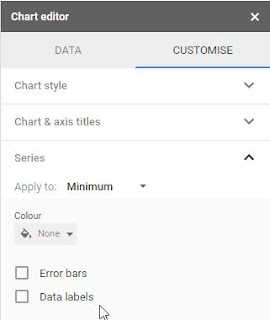
Then click on CUSTOMIZE and choose Series. Here is where you will use the error bar and colour magic to make this thing look a bit more like a box plot.
The first box will be 0 to the minimum filled in. Choose "no colour" to make it disappear.


The second box, Q1, should be coloured a really pale colour. I use pale yellow. Select Error bars, make sure the Type is Percentage, and set the Value to 100. This will give you a whisker that goes all the way to the minimum value on the left (and Q1 + min on the right, unfortunately.)


You can leave the next two boxes (Median and Q3) as they are, or you can play around with colour choices. Keep them different colours so you can tell the difference between the 2nd and 3rd quarters, and I'd avoid choosing colours that are too dark because that extra whisker stands out too much.


Lastly, set the last box Maximum to the same pale colour you used for Q1. Select Error bar, keep the Type as Percentage, and set Value to 0. Sadly, if you choose 100 you'll get a right-hand error bar that goes beyond the maximum, which I think would be too confusing.


Note: this would be even better in Excel, which allows you to choose left or right error bars.

Next, you can turn the legend off, set the minimum value to be something a bit more in line with your data, and add some extra vertical gridlines if you like.

So there you go: quasi-box plots in Sheets. Let me know if you find this useful or have any suggestions for making it even better.


(This is what it looks like if you put 100% error bars in the Maximum box. Not worth the confusion, in my opinion.)


Saturday, 27 October 2018

Upcoming (Really Soon!): Google Camp 6.0

Google Camp promotional poster

TDSB Google Camp 6.0 is next Saturday. It's sold out, naturally, but if you are lucky enough to go, I'll be presenting three sessions in room 218.

Session 1 is an updated and expanded version of Taking Math Digital with Desmos, Geogebra, and Equatio. Come explore tools that can make investigation in math, science, and STEM easy and fun. The Desmos graphing calculator, in particular the activity builder and activities such as Card Sort, Polygraph, and Marbleslides, is a valuable tool that makes helping students explore math concepts easy and interactive. Geogebra is a GSuite and user-friendly version of Geometer's Sketchpad. We will also talk about the updates to the Chrome extension EquatIO, helps write your math using predictive text, handwriting, and speech input, not to mention integration across all GSuite platforms.

Update: John McGowan, the creator of EquatIO, will be doing a Global Math webinar this coming Tuesday to talk about Digital Math Flow with EquatIO, Desmos, and Google. How timely!

In session 2, I will be giving an updated version of Flipping the Learning. This session will show you what a flipped lesson looks like, and how I am currently integrating flipped lessons into my math and physics classes. We will discuss the pros and cons, how it can be used for differentiated learning, and how to increase buy-in. In addition, we will discuss the technical aspects of flipping, specifically the specialized flipping platform EDpuzzle (but you can keep it as simple as YouTube and Google Forms). If you watch the video ahead of time, you will get the opportunity to delve deeper into some of the nifty features of EdPuzzle and have your first curated video ready for Monday's class!

In session 4, I'll be presenting How Random! Infinite Possibilities Using Sheets, which will talk about how to make the randomized practice sheets that are my pride and joy.  Sheets is useful for so much more than just accounting and graphs! Learn how the random number functions can be used to automagically create vocabulary lists, math problems, matching exercises, and yes, graphs... the possibilities are quite literally endless. Want to create a random question of the day? Sheets! Want the answer key, too? Sheets! Even better, you can link them to other GSuite products such as Docs, Slides, or Drawings to make collaboration easy. Sample templates will be provided so you can have a finished product ready to go for Monday's class.

It'll be a busy day, with lots of great workshops to choose from. If you can't make it to one of mine, I'll put links to the resources.

Hope to see you there!


Saturday, 12 May 2018

OAPT Conference overview and sundry nifty physics things I've been working on


I'm writing this on the train back from the OAPT conference hosted at the University of Western Ontario, and it was, of course, amazing. I have so many thoughts and new great ideas to put into practice. Some quick takeaways: 
  • thinking about using improv techniques in class to overcome my (and students') implicit bias, especially "Yes, and?"
  • "We use mathematics to help us make the physics more precise."
  • "Just because I don't have a 'math brain' doesn't mean I don't have something useful to contribute."
  • "You're not part of a group, you're part of a team."
  • Yes, the students do really need to draw a picture
  • Why haven't we been using the rotunda at Jarvis to make super-long pendula?
Also, this happened:
I think I'm going to have to wait until June to do the write-up justice.  I will share my presentation on Tweaking the Traditional Lab below; a link to various files and resources is posted in the resources section of this blog.


(Incidentally, one of the things I always like to mention when I'm introducing myself at presentations is how amazing the PD is on Twitter. The chart on the first slide is a perfect example. Elizabeth Houwen (a math teacher, incidentally) posted it last June, and I thought it would be a great way to get the students to practice unit conversions as well as estimation, and we also got a nice little lab out of it and an anchor chart so they have "reasonable" speeds to compare their answers to. All from one small tweet!)

***

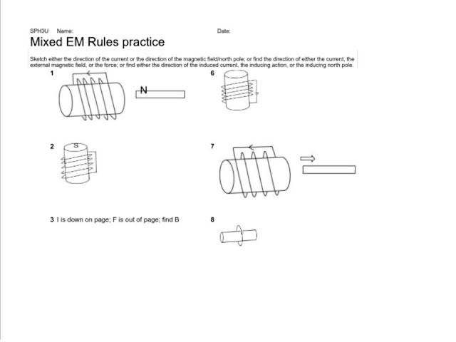
I've been busy converting my drill sheets practice sheets, which I mentioned in my last post) into Google sheets, as well as creating new ones. I'm fairly proud of the chemical nomenclature one (in part because I just found out how to write superscript and subscript numbers in Sheets, so the clunky ^3 _4 notation is mostly gone), but I really want to share the electromagnetic right-hand rules ones.

I made these using the =image() function, which allows you to put an image directly into a cell (and not just overlay the image on top). Unfortunately, you can't use the shared url of images on your Google drive (which is odd and annoying).

I'll probably refine the mixed version so that it's a little more clear what you need to find in each question; I'm not sure a student would recognize immediately that they need to find the direction of the action of the magnet for 1 and the location of the north pole for 6.

1st half of right hand rules practice sheet

2nd half of right hand rules practice sheet

You can find these and a lot more randomized practice sheets at my course website; click on the practice sheets link under Resources.

Incidentally, sometime between last December and April, Google changed the formatting of "publish to pdf" for Sheets so that it's landscape instead of portrait. There doesn't seem to be a way to modify this, and it's really mucked up my formatting. Everything is spread over two pages, and don't get me started about what it did to my spectroscopy sheets.

Please let me know if you find these useful!

Tuesday, 19 December 2017

Need spectrography and HR diagram drill sheets? Here you go!

In ongoing PD news, you can still register for the Ditch That Textbook Digital Summit; 9 videos, 9 days. The videos will be available until Dec. 31. Follow the fun at #ditchsummit on Twitter.

I'm still trying to put together my blogs for the fall PD I've been doing, but for now I wanted to share a few things I'm really excited that I figured out how to do.

Inspired by Robert Prior many years ago, I started coding a lot of Excel spreadsheets as randomized drill sheets on many topics. My goal for this year is to get most of them up as Google Sheets so I can publish them to the web and students can go straight to my website to print out an infinite number of sheets.

Anyway, I've also been working on adding new, richer sheets to my catalogue. In particular, I was very jazzed last year when I figured out how to get a spreadsheet to draw spectrographs (hint: error bars). And last night I spent far too long working on how to get a Hertzsprung-Russel diagram (yay for the Bubble chart, boo for the fact that the labels are arbitrarily hidden when you go to a larger font).

Behold, I give you my Spectrograph and HR diagram drills for the grade 9 space unit (and Earth and Space science, too).
jpg of spectroscopy drill sheet; click link for other sheets.jpg of HR diagram drill sheet; click link to see the pdf versions

I'm still working on the HR diagram answers; I have to figure out how best to get it to choose whether it's on the main sequence or not. Also, I think I need more white dwarf stars, because that area is looking pretty sparse.

However:
gif of Liz Lemon high-fiving herself

 If you'd like to see my other drill sheets, head on over to the drill sheet section of my course webpage. It's very much a work in progress. I have a lot more sheets than I've listed there.

Sunday, 4 June 2017

Updated: Fidget spinner math


Update: I've added a link to the data in Desmos and TI lists below.
Yes, I jumped on board the "if you can't beat 'em, join 'em" boat.

Inspired mostly by Harry O'Malley's site, I brought a fidget spinner* and my phone to grade 11U math class one day and the students modelled the spin. The above graph is the one of my student's results. It's a bit wonky because in the two days since I had bought it, one of the end caps had fallen off, which made the central bearing ring shift off centre. This made it slow down a lot; the above graph shows a few tries at spinning. The student at the top of the post took an average of the cycles while other students just looked at the first.


To make a good video, mark one of the edges of the spinner so you have a reference point to track. The app I used is VidAnalysis Free for Android (for Apple fans, Vernier has an app for LoggerPro that lets you do the same stuff, if not more). Don't spin it too quickly unless you have much better equipment than I do -- I tried to analyse that lovely first video and got goobledeegook because it's spinning too fast for the video to capture properly.

You then pick reference points (known length and origin of coordinate system) and track your mark. You can skip forward and backward in time to get to the section you want to analyse. I goofed because I forgot that I had made a spin without my finger in the way; by the time I remembered, I had already invested too much time getting the other data. Hence the starts and stops.

I didn't want to take up class time getting the analysis ready, so we discussed what equation we were likely to see, and then worked on other problems. Before the next class, I made the analysis and turned the data into graphs in Google Sheets. The next class, I put the x-distance graph up on the screen and got the students to figure out the model. When they had an equation, I graphed it against the data (if you do this, remember that spreadsheets do trig with radians, not degrees).

It was a really good exercise, considering it's the first time I've officially used the VidAnalysis in class. We had some great discussions about the vertical translation (did I deliberately make the coordinate system off-centre? no, but I will next time because that led to interesting math); how to deal with the increasing period; how the amplitude of our function compared with the actual measured distance.


I've since shifted the centre bearings back and made another, better video analysis. The screen shots are below:
What I like about this, mathematically, is a) how it shows the spinner slowing down; b) how it shows that I didn't hold the camera completely still -- notice that the "zero line" of the equation shifts up (nice for composition of functions!); and c) the x- and y-distances are essentially translations of each other (sin vs cos). I could have really expanded on this activity and got them to break the functions into different domains.

The velocities show the same math effects as the distances; this could be used to show that the derivative of sinusoidal functions are still sinusoidal (and how). If only Google Sheets would get their act together and let us connect points in scatter plots.

More screenshots. What I really like is that you can upload the data as a csv file to Drive.
Copy-paste makes it simple to create a spreadsheet.

Note that the Free part of the app means ads. I was still giving it a trial run, but I think I will upgrade to the premium version because it's a great little app.


I started the trig functions section by creating a periodic wave using a salt-shaker pendulum (an idea I cribbed from someone on Twitter -- I can't remember who it was, but I'd love to give her the credit). I now wish we had filmed the pendulum at the same time so we could compare our rough model to the data. Future ideas!

I have a graphing calculator assignment that grabs tuning fork data from a microphone; I get the students to model the function and work backwards to determine the frequency of the fork. We didn't get to it this year, but it would go well with this exercise.

If you'd like to use my data, feel free to make a copy of fidget spinner 2, or download the csv file. I'm going to import this into a Desmos activity and graphing calculator lists at some point; when I do, I'll update this post with links. Update:Here are links to the data in Desmos and as TI lists.

*I meant to use one of the students' spinners in my MCF3M class, but ran into difficulties because that student wasn't in class the day we were supposed to do the model. Since I wanted a permanent mark on the spinner, I decided to not buy trouble and get my own. Plus, they're fun.

I did this exercise with the 11M students as well, but we wound up doing it as a class instead of individually.

Monday, 20 February 2017

A script for turning Sheets data into Calendar entries (part 5)

Here is the final step in turning homework tweets into Calendar entries. Catch up here...
The gist of this step is that adding a new line to the top of a course's "hw to calendar" Sheet triggers a script that turns the info into a Calendar entry. (This is why the tweets are listed in order of date+time tweeted and not the due date.)

There is probably a way to do this from within the master "Tweets by @Ms_McPhee" Sheet, but when I was setting this up last summer, I couldn't find anything straightforward apart from this script I grabbed from a blog post (which I've lost the link to, so thank you anonymous blogger for your help). I know just enough about coding to add to someone else's code, so it may be clunky, but it works.

When I was testing this last summer, I had no difficulties. Naturally when school started and I was tweeting in earnest, a couple of strange little bugs appeared. Namely, each time the Sheet changed the script ran twice and I got two identical Calendar entries. Also, any time I tweeted anything, homework or not, or was retweeted, or was even mentioned in a tweet, it "changed" the Sheet (even if there was no actual change to the content), triggering the script. Twice. Which created more identical calendar entries. Sometimes I would have upward of 12 identical homework (or even worse, test!) entries on one day. Some of the students were a little startled, and I was spending far too much time in Calendar deleting superfluous entries.

To solve the second problem, I threw in a validation process. You'll need to add the following formula to cell M1:

=COUNTUNIQUE(C:C)

N1 also has a number in it, added by the script; you should leave it blank to begin with. The script now checks the number of essentially non-blank (or unique) rows and compares it to the number in N1. If N1 is less than the number of rows (meaning we've just added new homework information to the Sheet), it will run the calendar function and set the number in N1 to the number of rows. Otherwise, it's a fake "update" and the script can ignore it. It works well; now I can participate in Twitter chats without stressing out my students in the Calendar. The only thing I have watch is when I tweet out similar homework for different sections of a course to make them slightly different; usually all I need to do is change a punctuation mark.

I haven't worked out what's going on with the double posting, though. It now seems to be happening more or less randomly.

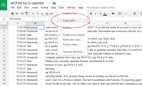
Here's how to  get the script running. From the Tools menu, select "Script editor."
screenshot of tools->script editor

A new window will open. Delete the older code, and copy the code below in its place . it's a wee bit long, because my rule is to never delete anything but instead comment it out in case I want to use it later. I grabbed most of this from the internet; the main thing I added is the row counter business.

I'll explain what a few of the lines do. In general, a // in front turns the rest of the line into a comment and a semi-colon finishes an instruction.
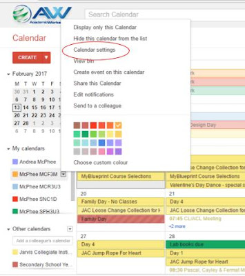
  • Row 4 tells the script which calendar to use. To get the calendar id, click on the triangle next to the desired calendar and choose Calendar settings.
screen shot of calendar settings

Scroll down to where it says Calendar Address. It's the code next to "Calendar ID," oddly enough. Copy that into the space between the quotes.


  • Rows 8-22 say which columns contain which pieces of information is in. It's a letter-to-number cipher, so A=1, B=2, etc.The start date is in column 1(A), the title in 2(B), the description in 3(C), the row counting cells are in 13 & 14 (M & N).

Rows 24-55 are the main script function, getLatestAndSubmitToCalendar, which is pretty much what it says on the tin.

  • Rows 26-32 get information about the sheet, including the number of  rows (which I don't think I need, but they were in the original script and so I left them. I'm not sure why). The original script took the information from the last row of the sheet, but importrange() turns that into a bottomless pit, which is why I reverse sort them.
  • Rows 34-47 get the actual date, title, description, and row-counting information from the Sheet.
  • Rows 50-55 run the createEvent script only if a new row has been added to the Sheet, and updates N1 to match the number of rows so a new calendar event won't be created if some other "change" is made to the Sheet.
Rows 57-70 are the createEvent function, which actually creates the Calendar entry. This is pretty straightforward. I set it up to create all day events because I think it makes the Calendar look less cluttered.


Before you can release it into the wild, you need to give your script permission to muck about with your Calendar. Save the script with a useful filename, then click Run -> getLatest...Calendar. During this run, a box will pop up asking to allow permission for the script to change your Calendar, etc. Let it. Then run it again to make sure it's working smoothly. I usually check it by manually changing N1 back to 0 (or one less than the number of unique rows), running the script again, checking that N1 has been changed, then checking the Calendar to see if the entry was created. You should get email notifications if the script fails to run.

The last step is to set the trigger. We want this script to run every time a new row is added (that is, when the Sheet is changed). Click on Resources -> Current project's triggers, or the stopwatch icon. If no triggers have been set, click on "No triggers set up. Click here to add one now.".  Make sure "getLatest...Calendar" is selected under Run. Under Event, change "Time-driven" to "From spreadsheet," then choose "On change." Save the script, test it out by tweeting something, and you're now automatically turning your tweets into calendar entries.


So there you have the somewhat involved process of turning tweets into Calendar entries. Please let me know if you have any questions or  suggestions -- especially about that nefarious double-trigger issue!

Friday, 17 February 2017

Importing data to a new Sheet (part 4)

Update 17-03-17: Since originally writing these posts, I've learned more about what query() really does, so I'm updating some references.

Part 4 of an going series dealing with taking tweets about homework, sorting them, putting them on the course website, and creating Calendar entries. The story so far...
This (mercifully short) post will talk about how to link data in a parent Sheet to a completely separate Sheet. I need to have a separate Sheet for each course to run my calendar script, but there are any number of reasons you might want to link Sheets instead of just making a copy. If you want to embed only certain columns or tabs in the new Sites or in Classroom, it's easier if you import the data into a new Sheet first. The other reasons all pretty much have to do with the fact that if you make a change to the data in the parent Sheet, the new Sheet will update as well; a copy is not linked and won't update.  

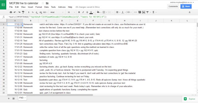
It's really easy to do. Create a new sheet (I call mine "CourseCode hw to calendar") and copy the following code into cell A1:

=query(IMPORTRANGE("1hgVADAoR-TlKYPGawmMCmxaQKZ77lkKpbSdNozjzcCQ","Tweets for MCF3M!U:W"))

Importrange() will link to the data in a separate Sheet; it will update when you open the spreadsheet. (Query() lets the spreadsheet update without you having to open it, which is what automating is all about. sort/filter the data and is not strictly necessary here.) You will need to change both the red and the blue text for your Sheet.
  • The red text is the spreadsheet key of the main sheet, which you get from its url: https://docs.google.com/spreadsheets/d/1hgVADAoR-TlKYPGawmMCmxaQKZ77lkKpbSdNozjzcCQ/edit#gid=652985193
  • The blue text is the name of the tab you are getting the data from, followed by a ! and the columns you want. In this case, it brings in the columns with the sorted and reverse-dated tweets.
Note: When you're setting up the spreadsheet for the first time, you need to give access to IMPORTRANGE() first.*

screenshot of #REF! error: 'You need to connect these sheets.'

Give permission, and wait for your new sheet to populate...

screenshot of "adding permissions"

Once permission has been granted, you'll have a nice Sheet you can embed (or run a script on) with no worries. Any changes to the linked cells in the parent Sheet will automatically update in this one.

screenshot of populated imported data

The final installment of this series will talk about the script to create calendar entries from this data.

*At the beginning of the year, for each sheet I set up importing from the main one, I needed to copy the importrange part into another cell of the spreadsheet, click on the red error triangle, allow access, then delete that cell. When I was trying to grab screenshots for this post, new sheets already seemed to have access to the main one, which was a nice surprise. It looks like my setup time for new courses will be slightly reduced!

Monday, 13 February 2017

Publishing a Sheet to the web (part 3)


Previously, on equals mc2...
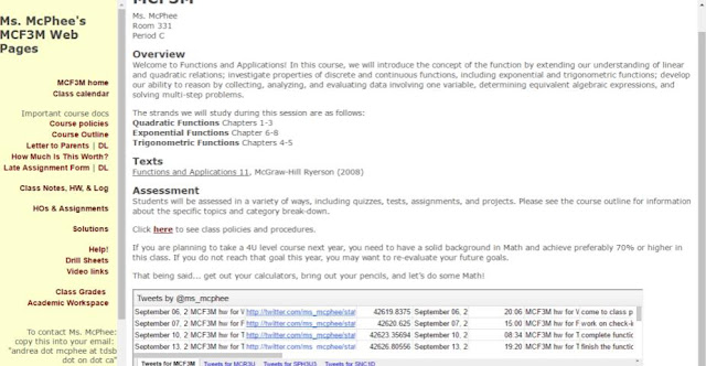
screenshot of website; click on my course pages above, pick a course, click on 'Class Notes' in the sidebar, and scroll down.

In this post I'll show you how to create the code to create a link to a webpage of (or embed) Sheets* data and talk about some things you have to watch out for. The 'Publish to the Web' feature is the other thing** that makes not just Sheets, but all of the GAFE tools supremely useful. I use it for lots of things, including self-grading quizzes and drill sheets, but I'll talk about it in the context of embedding my sorted homework tweets on the course webpage.

Update 17-03-17: You could probably do a lot of this with something like Awesome Tables, but if you're a noodler like me, you might do it this way.

Something to note: publishing to the web lets anyone who can visit your webpage (or who has the link) see your data; it makes a copy of the sheet and that's what is published. Any permissions you had on the original Sheet won't be copied over, and people might be able to see the underlying data for charts.

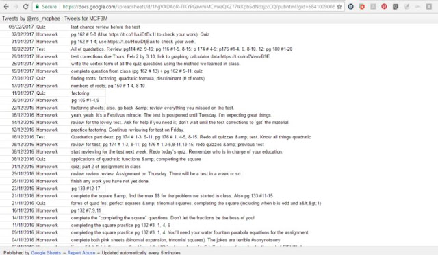
First, decide whether you want to create a web page, PDF, or a spreadsheet format, or if you want to embed the Sheet/tab*** in an existing webpage. Embedding a sheet looks like the screenshot above. Publishing it as a separate webpage looks like this:
single tab of sheet published to website

Here's how to do it. I'll talk about creating a link first, since embedding means a bit more work if you have columns to hide.

If you want to link to only part of a tab or more than one of the tabs (but fewer than all) in a sheet, you have to hide everything you don't want seen. Highlight any columns you want to hide (in the case of the homework tweets, that would be columns A-T), click on the triangle in the column header, and select "hide column."  If you want to share multiple (but not all) tabs, click on the triangle on the tabs you want hidden and select "hide sheet." Bear in mind that if you unhide anything, it will be visible on the web until you hide it again. I also take the time to get rid of the gridlines to keep it looking uncluttered.

Once you've taken care of that, you're ready to publish. Click on File->Publish to web.
screenshot of publish to web under file menu

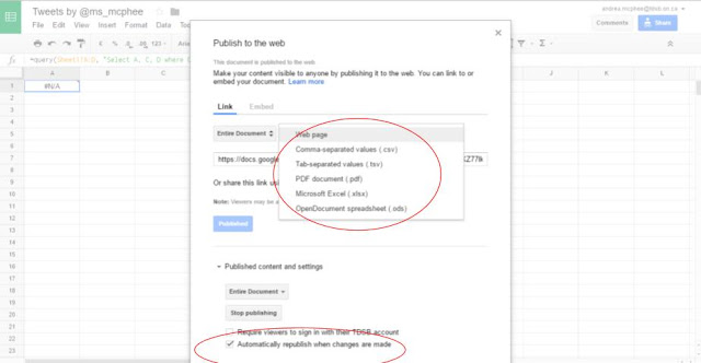
The default choice is to create a link to a web page, but you can also create a PDF.
screenshot of types of output

The "automatically republish when changes are made" should be checked -- unchecking it creates a static page that won't update.

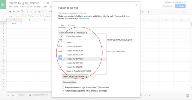
If you only want to publish one tab at a time, select it from the list. If you want to publish more than one tab in the same page, select "Entire document."

screenshot of selecting a few tabs to publish

I've been playing around with this a bit, and if you select several tabs from the lower menu, it will only publish one tab at a time. It looks like if you want to publish each tab separately, you have to close the 'publishing' pop-up and reopen it, choosing a separate tab to publish (getting an entirely new link). You would need to check off each tab you want to publish from the lower menu. However, I might be wrong and it might stop publishing the previous tabs. (I should say that I import my columns U-W into an entirely new Sheet for each course because of the calendar script, so I don't have to worry about hiding columns and I have only ever published one tab at a time from any given sheet.)

Here's what it looks like if you publish more than one tab at the same time using "Entire document." The user can click the links at the top to visit the different courses.
screenshot of sheet published to website (multiple tabs)
In the above example, I tried choosing to publish only the first four tabs, but it published the last one anyway. I hid Sheet1 and another tab, and as you can see they didn't get published. Hide what you don't want others to see, because the selection defaults to only one tab or the entire (viewable) document.

Any time you change the original Sheet, the webpage (or PDF, etc.) will also update. If at any time you want to stop publishing the Sheet, go to the publishing tab and click "Stop publishing" at the bottom. That way even if someone still has a link, they'll get a "We're sorry; that page is not published" error message.

Embedding a Sheet works the same way for the most part, except that you get html <iframe> code that you add to your site or blogpost. The main difference is, because you're embedding a copy of the Sheet, it will publish every column, including any you have hidden. To fix this, you need to either a) bring only the desired information into a new tab or Sheet and embed that (this is what I do) or b) manually add code to limit the range you embed. This post from hellotumo.com explains how to do that.

You will need to manually add width and height codes since the default is pretty small. I add width="90%" but keep the height the same since I only want the most recent homework tweets to be visible; users can scroll down to see older tweets. The code will look something like this:

<iframe src="https://docs.google.com/spreadsheets/d/1hgVADAoR-TlKYPGawmMCmxaQKZ77lkKpbSdNozjzcCQ/pubhtml?gid=769621547&amp;single=true&amp;widget=true&amp;headers=false" width=90%></iframe>

Below is what happens if you embed a sheet (with multiply tabs) and try to hide columns.
screen shot of embedding multiple tabs

I did hide columns A-T in the original sheet, but embed doesn't care. It does care that I hid a few tabs, which is nice of it.

In my next post, I`ll talk about how to import data from one Sheet to another. The final post will deal with the script to create a Calendar entry.

*If you are using Sites or Classroom, embedding the Sheet is easy; however I recommend importing the relevant information (such as the formula for column U) into a new Sheet since there doesn't seem to be a way to embed only one tab without hiding the rest and it won't let you hide the other columns. Here's hoping that the new Sites gives us an html code widget soon.

**The query() function being the best thing, of course. Oh, and that collaboration business.

***Again, by "tabs" I mean the different "sheets" within any one "Sheet," because that's just confusing.